One of the promises I made myself at the start of 2019 was that I would finish learning one new tech or one online course per month. I have already started the Machine Learning course by Tom Mitchell in January (you can find my online notes here) and still going on. For the month of February, I wanted to learn something less exhaustive and chose ‘Interactive Python Dashboards with Plotly and Dash”.
Data visualization is a quick and easy way to convey the message universally. If you are looking for a way to visualize your data and share it with others, [Dash] is an excellent option. With about 100 lines of code, I built an interactive dash to analyze time series data for a financial service company. Written on top of Flask, Plotly.js, and React.js, Dash is ideal for building data visualization apps with highly custom user interfaces in pure Python. Through a couple of simple patterns, Dash abstracts away all of the technologies and protocols required to build an interactive web-based application, making this framework particularly suited for anyone who works with data in Python. It supports the OAuth authentication to secure the dashboards as well.
What is the difference between Matplotlib, Plotly, and Dash?
=> Matplotlib: Static Visualisation
=> Plotly: Animated visualization, generated in a file (e.g. HTML)
=> Dash: Real-Time animated visualization
Table of Content
Week 1:
- How to build your first dashboard using Dash
- How to build Scatter 2D and 3D plots in Dash
Week 2: - How to make Heatmaps using Dash
- How to make Time Series Plots using Dash
Week 3: - How to make dashboard using Dash in Jupyter Notebook
- Case Studies
Week 4: - How to Deploy Dash dashboards on various platforms
My Notes:
Dash makes it dead-simple to build a GUI around your data analysis code. Dash app code is declarative and reactive, which makes it easy to build complex apps that contain many interactive elements. Here’s an example with 5 inputs, 3 outputs, and cross-filtering. This app was built in just 160 lines of code, all of which were Python.
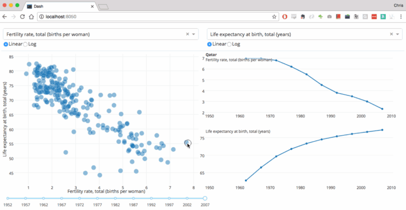
Every aesthetic element of the app is customizable: The sizing, the positioning, the colors, the fonts. Dash apps are built and published in the Web, so the full power of CSS is available. While Dash apps are viewed in the web browser, you don’t have to write any Javascript or HTML. Dash provides a Python interface to a rich set of interactive web-based components.
Architecture
10 Cool Dashboards for Insipiration
-
INTERACTIVE REPORT
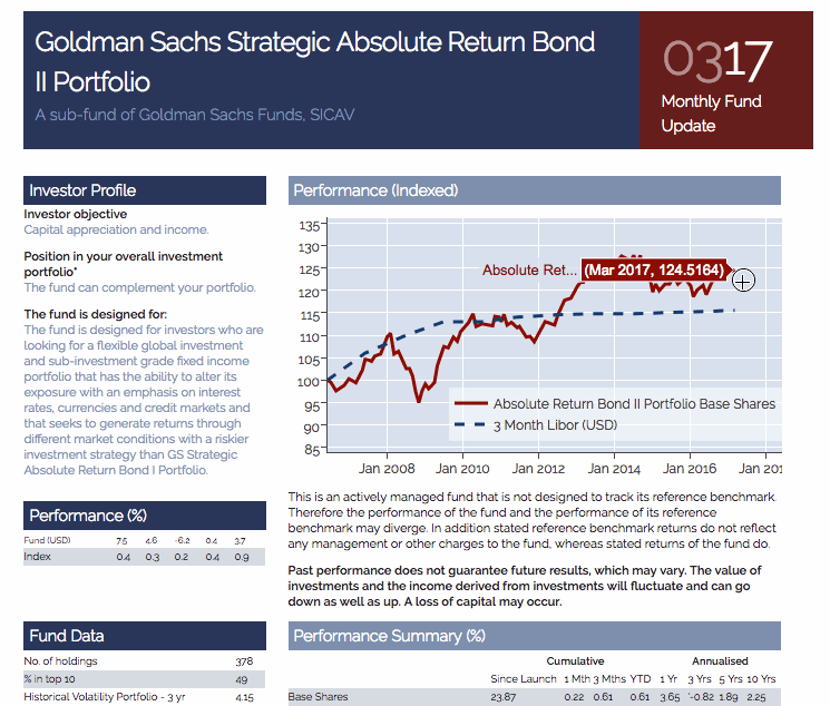 This application recreates a Goldman Sachs report. Dash’s flexible framework lets you customize however you see fit. This dashboard is created in the brand colors and style of Goldman Sachs. See it in action: https://plot.ly/~jackp/17561.
 -
INTERACTIVE SPREADSHEETS
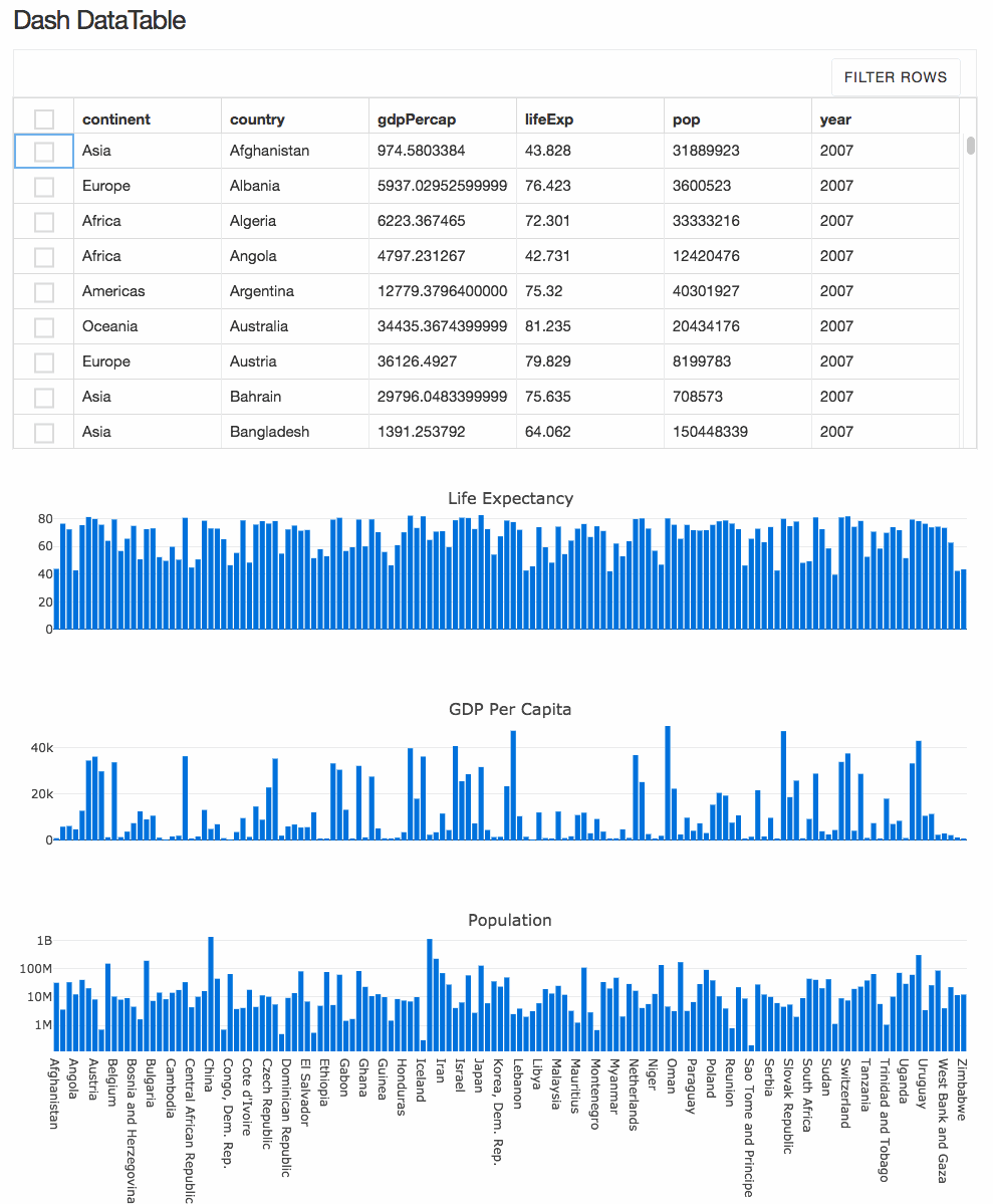 Create complex, spreadsheet-driven applications with Dash DataTable. This interactive table lets you view, edit, and explore large datasets from the web browser, and is Plotly’s most complex Dash component to date. DataTable is a Dash component. For more information, visit: https://dash.plot.ly/datatable.
 -
SALES DASHBOARD
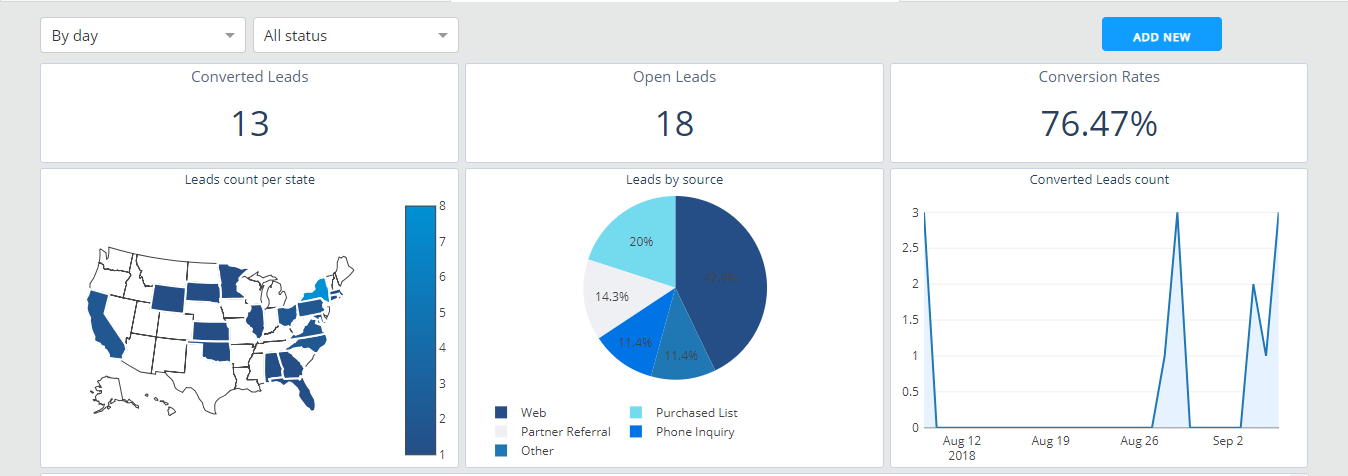 Keep tabs on your organization’s sales activity with a Dash app. Check out this traditional dashboard-style CRM application, where you can switch between multiple tabs to track leads, sales, and sources using the most appropriate charts for each scenario. Try it out: https://dash-gallery.plotly.host/dash-salesforce-crm
 -
MANUFACTURING ACROSS TIME
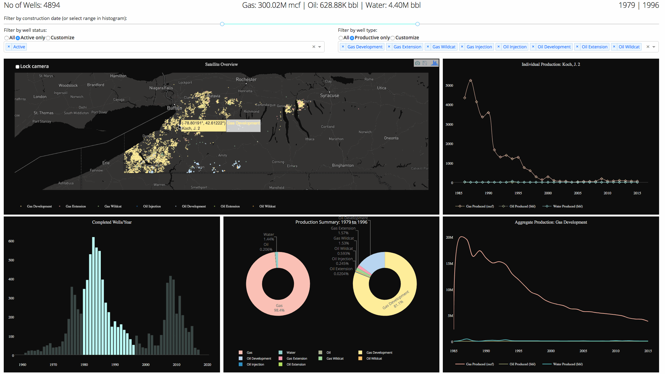 Need a wide-angle view? Dash has you covered. Select the desired time range you want to explore using interactive sliders and graphs. This particular dashboard-style application displays New York State natural gas well production. See how it works: https://dash-gallery.plotly.host/dash-oil-and-gas
 -
MULTI-LEVEL PIE CHARTS
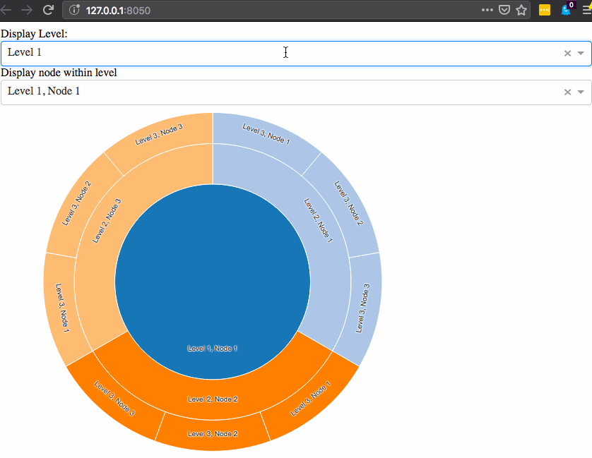 Also known as sunburst graphs, these visualizations are great for displaying hierarchical data. Dash apps are interactive, so you can take your data communication a step further by exploring different data categories as the graph updates in real time. Dash sunburst graphs are a component that can be inserted in your Dash application. Learn more here: https://github.com/plotly/dash-sunburst
 -
NETWORK GRAPHS
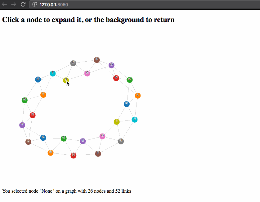 Understanding relationships is key to business. Whether it’s a complex supply chain, new organizational layout, product distribution, or social network, Dash network graphs are a dynamic way to explore and display complex relationships. Network graphs are a Dash component. To learn more: https://github.com/plotly/dash-network
 -
TRACKING THE MARKET
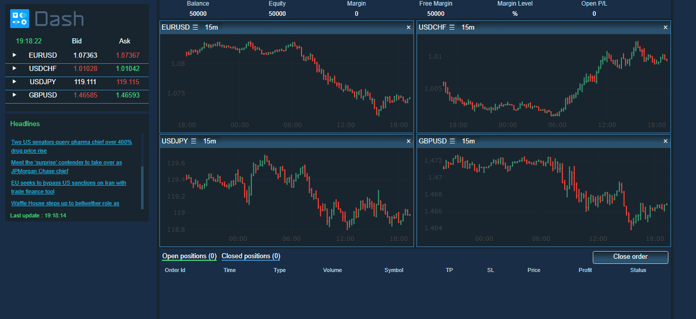 Get a live visual on the day’s ups and downs with a Dash app like this one, which tracks the foreign exchange. Dash’s callback system enables continuous queries for the latest updates, no matter which market you’re targeting. View the demo app here: https://dash-gallery.plotly.host/dash-web-trader
 -
MULTI-YEAR MAPPING
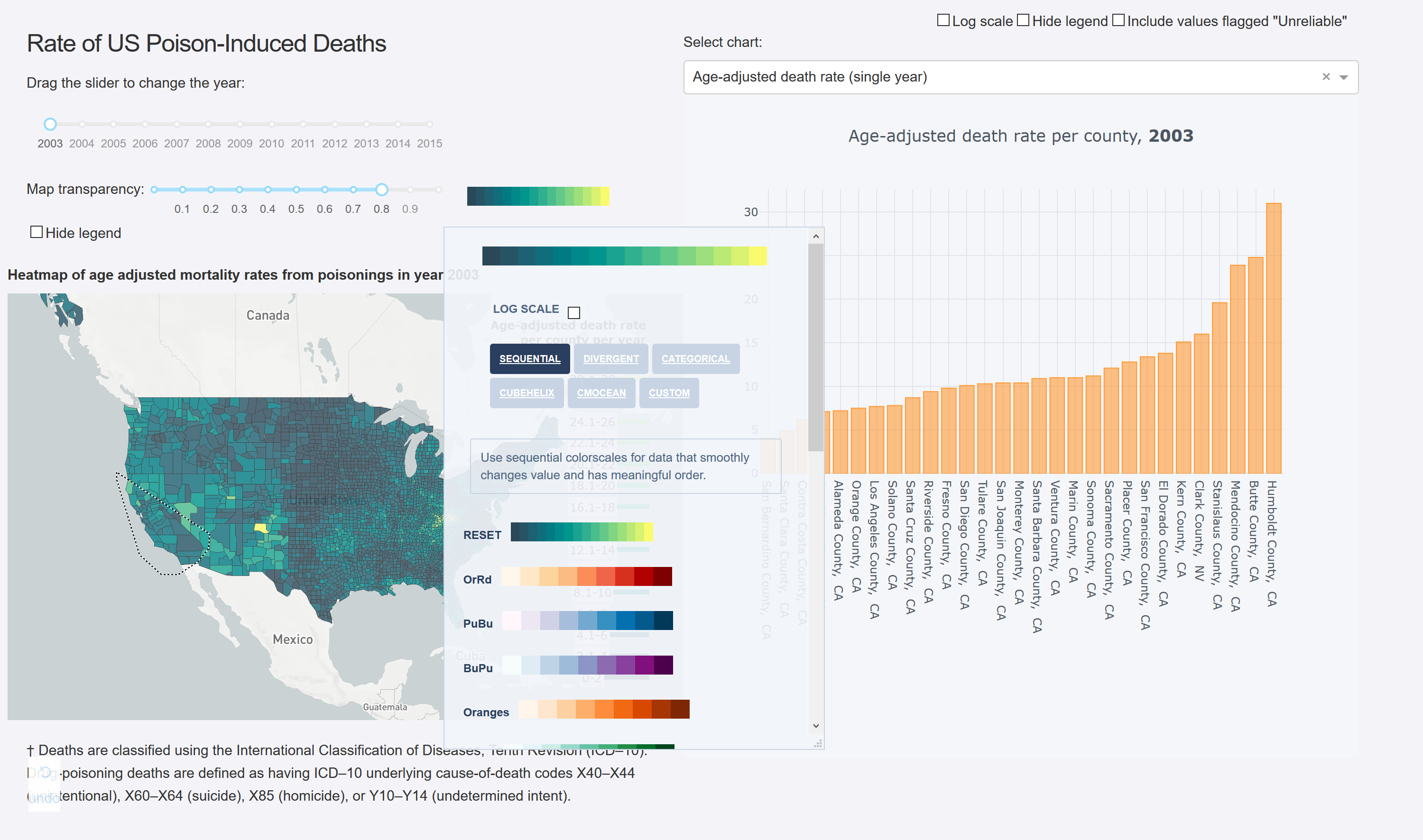 This Dash app shows over a decade of U.S. county-level data for exploration, and was written in less than 400 lines of Python code. You’ll see that each interaction with the sliders, map, graph, colorbar, and dropdown automatically updates the rest of the app’s features.Start exploring: https://opioid-epidemic.herokuapp.com/
 -
VISUALIZE MACHINE LEARNING
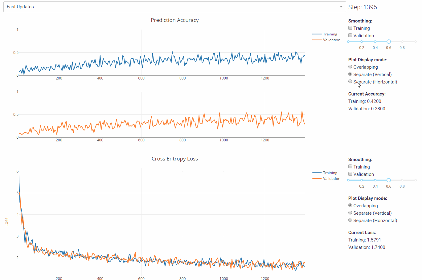 If you’re using machine learning to sharpen your business intelligence, an accurate model is everything. This Dash app visualizes accuracy and loss, two key factors when training your model. The real-time feedback is extremely useful, and it’s possible because Dash’s Python interface integrates so well with unstructured data and analytical code. See how it works: https://dash-gallery.plotly.host/dash-live-model-training
 -
NATURAL LANGUAGE PROCESSING
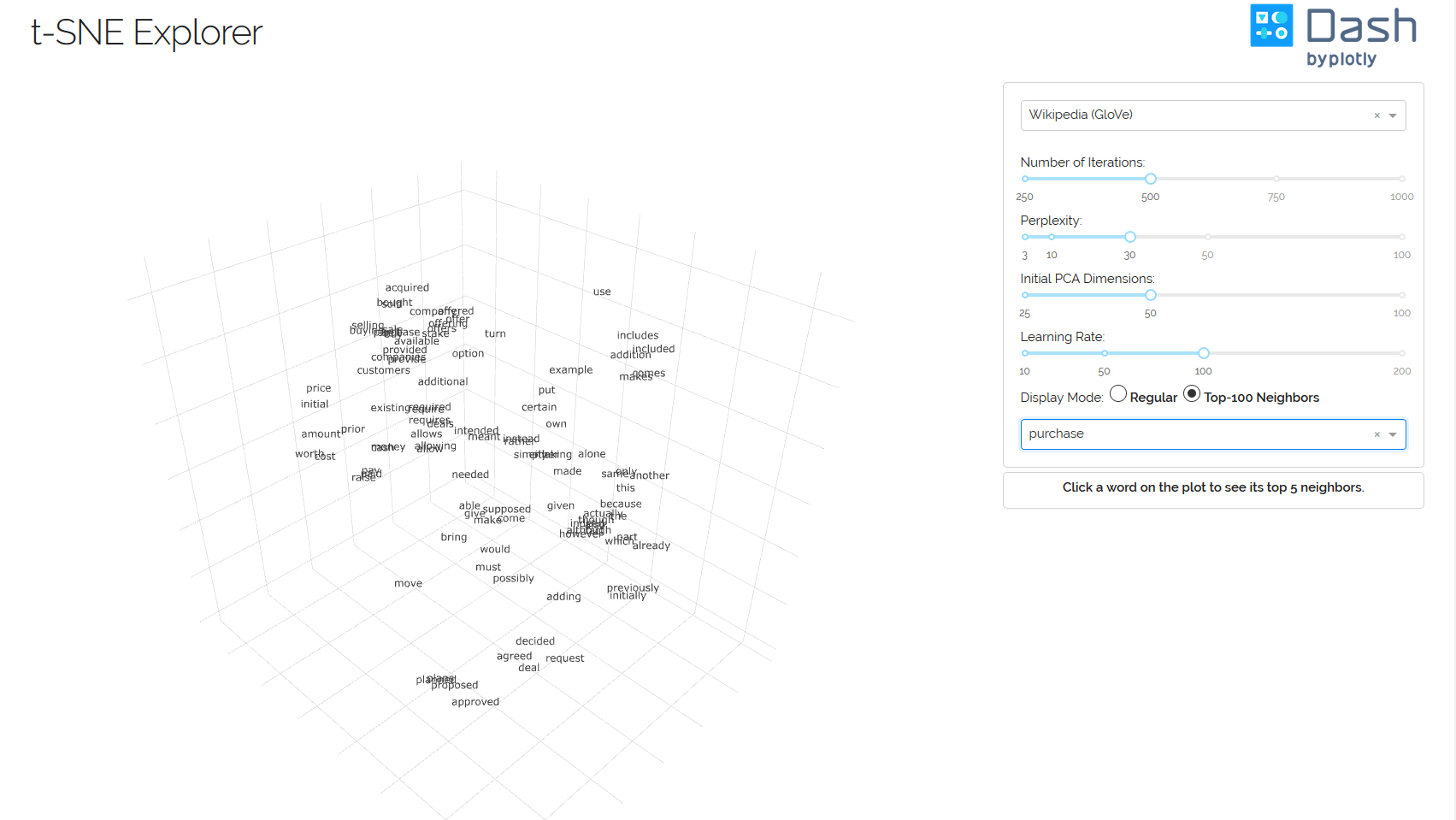 Speaking of machine learning, if you’re using it for natural language processing, you may be interested in word embeddings. This Dash app maps how often words appear near each other in a text, with regards to how often they are used. Try it yourself and get the technical details here: https://dash-gallery.plotly.host/dash-tsne
 -
Interactive Machine Learning Explorer
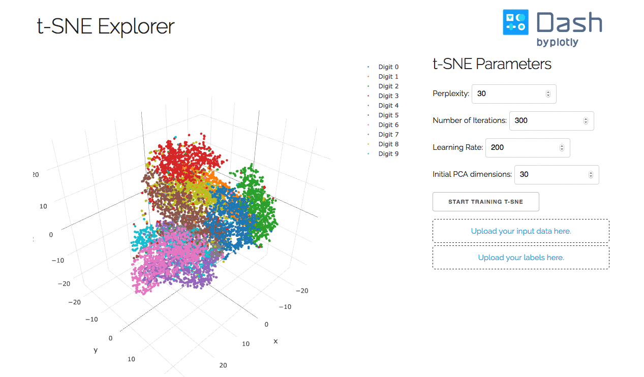 This is an interactive machine learning explorer for clustering data with t-distributed stochastic neighbor embedding (t-SNE). Published by Van der Maaten and Hinton in 2008, t-SNE is an algorithm that reduces a high-dimensional space into two or three dimensions, so we can more easily see how data is clustered. UMAP has been reported as an alternative clustering method to t-SNE recently — can you make a Dash app that clusters data using UMAP? https://dash-tsne.herokuapp.com/
 -
UFC MMA Predictor Web App
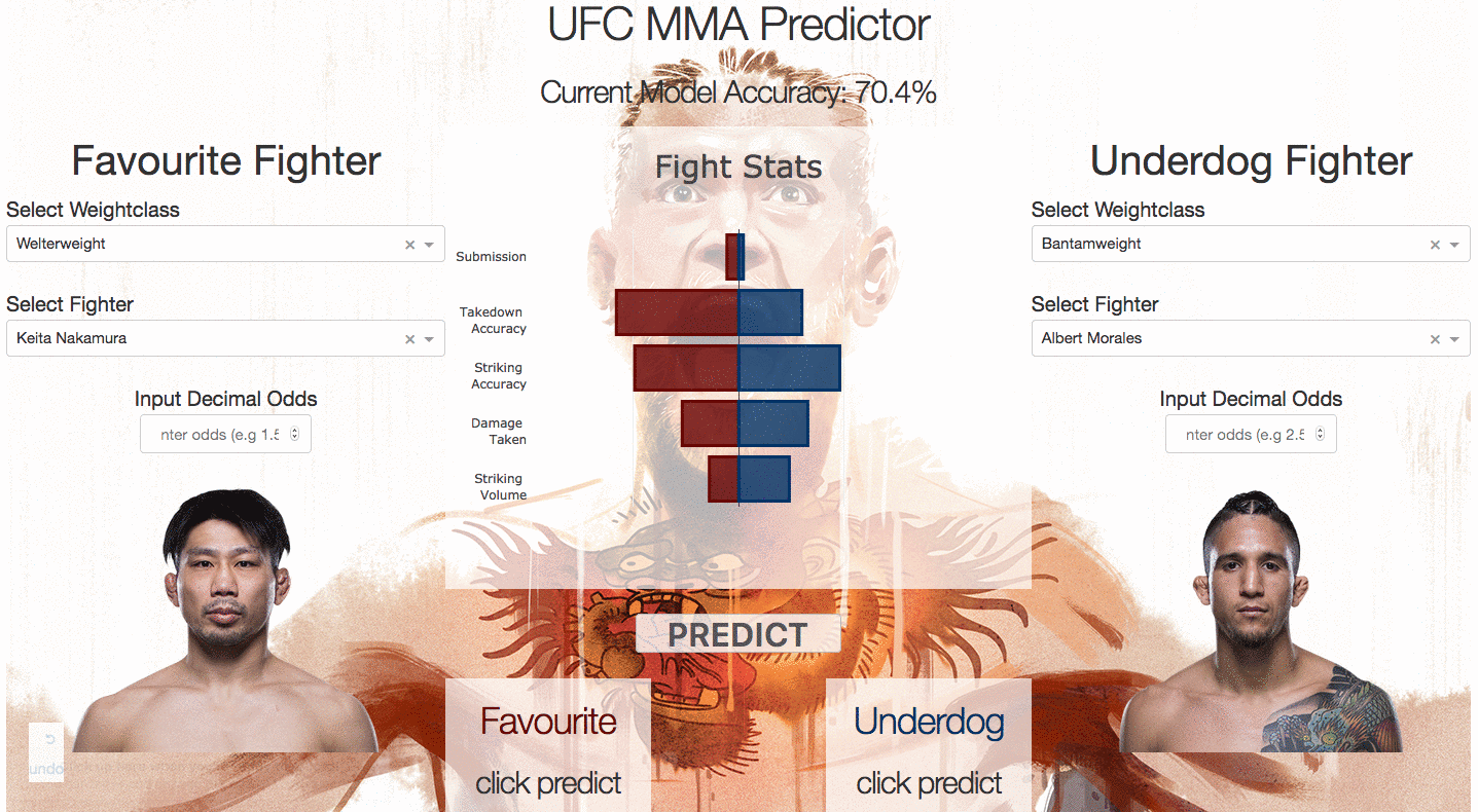 This Dash app has had some success predicting UFC (“Ultimate Fighting Championship”) match outcomes. https://ufcmmapredictor.herokuapp.com/
I highly recommend Plotly as a visualization toolkit. Well, I will be giving up Matplotlib and taking up Plotly for a very long period of time now!
Further Resources and Footnotes
- Dash User Guide https://plot.ly/dash
- Plotly GitHub https://github.com/plotly
Follow Plotly on Instagram: https://instagram.com/machine.learning.club
 Quick-start Guide to R for Actuaries!